Empowering developers through reusable code
A developers' platform for reusable code
A developers' platform for reusable code
A developers' platform for reusable code
Role:
UX Design and Research
Type:
Internal platform
Timeline:
Aug-Sep 2022
An energy company has an internal platform for its developers' community, where they can learn, work on their development, and share knowledge and best practices. This is how we improved the Code library, a place for them to share reusable code.
Before

After
CONTEXT
What were the problems?

Hard to scan
Unsorted lists that were difficult to read or scan. Illustrations that didn't relate to the information translated in noise for the developers.

Hard to find
To reduce the cognitive load, the team removed the images and the list of reusable code. This decision hid all the code components outside this section, making it impossible to find the code contributions.

Hard to understand
The company wanted to promote these categories. However, the developers didn't understand the relationship between the categories and the code components.
GOALS
How would an enjoyable
experience could look like?
1. Discoverability
How might we design an experience that allows users to find the necessary code resources?
2. Scalability
How might we create a scalable solution to accommodate the growing code contributions?
3. Clarity
How might we avoid confusion and make it clear to developers what can they expect from the code library?
DESIGN APPROACH
Every element counts

Be clear and let the users know what to expect
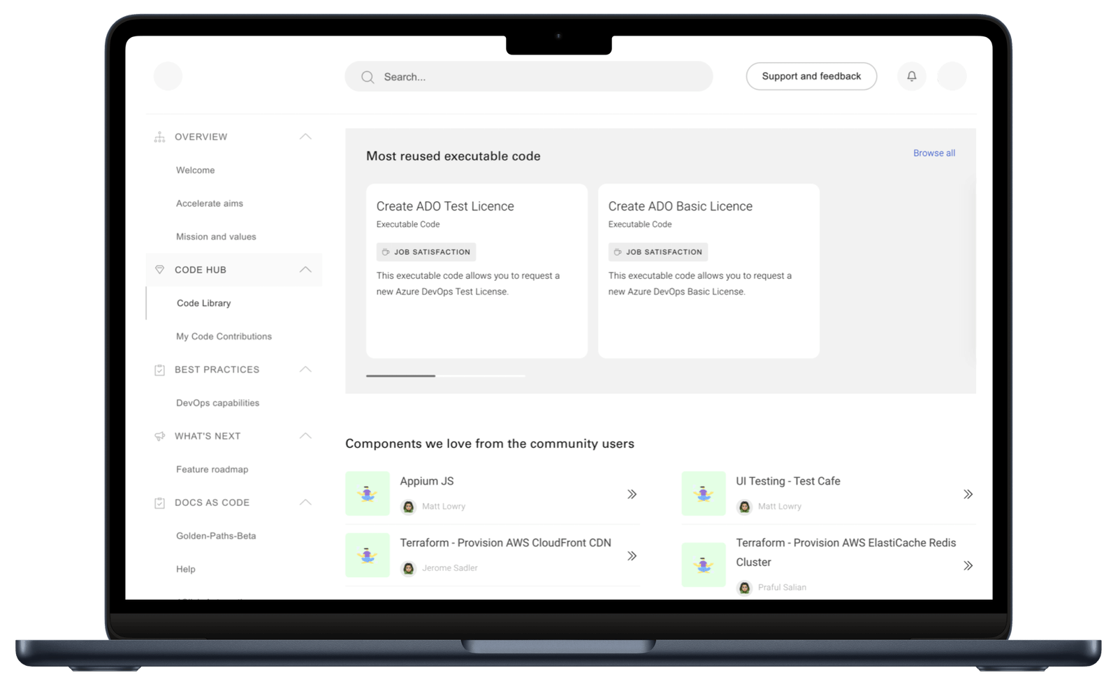
Using cards with descriptions to navigate the platform makes the information easier to scan and reduces the cognitive load by showing fewer elements to focus on.
Search and Filters allow users to discover the correct code quickly
Adding icons to show the type of code or how the community supports it, gives users more confidence about the resources in front of them.


One card to rule them all
All sections are designed following the same patterns and with a similar types of cards to make it easier for the users to use the code library and for the engineering team to code the product faster.
TESTING
Learning from our users
I supported the UX researcher to do moderated testing of two prototypes with six developers and managers of varying levels, to assess: platform understanding, initial thoughts, and preferences for the amount of elements.
Version A

Version B

Research insights
Easy navigation
All users found their way and said the page was easy to navigate and find information.
Categories sparked curiosity
Users didn't get them, but with a proper strategy, they can be popular in the future
Quick access to dev language
Users would like quick access to code contributions of their favourite languages.
Value for social recognition
All users would like to contribute and be perceived as a supporter of the community.
HAND OVER
Walkthrough of the final UX

After incorporating the users' feedback, I worked closely with the UI designer and developers.
I provided clear direction to the UI designer to ensure they understood the UX reasoning, chose appropriate components, and created a cohesive UI.
I gave user flows and design assets to the developers to guarantee a great product quality and user experience.
Do you have any questions? Send me a message