My Role: Product Designer
Platform: Desktop
Type: B2B
Project scope: 1 year
revenue optimization workbench
Maximizing revenue to keep Emirates Airlines competitive in the market
Earning Miles without flying & supporting Emirates Airlines to expand its partnerships
Earning Miles without flying & supporting Emirates Airlines to expand its partnerships
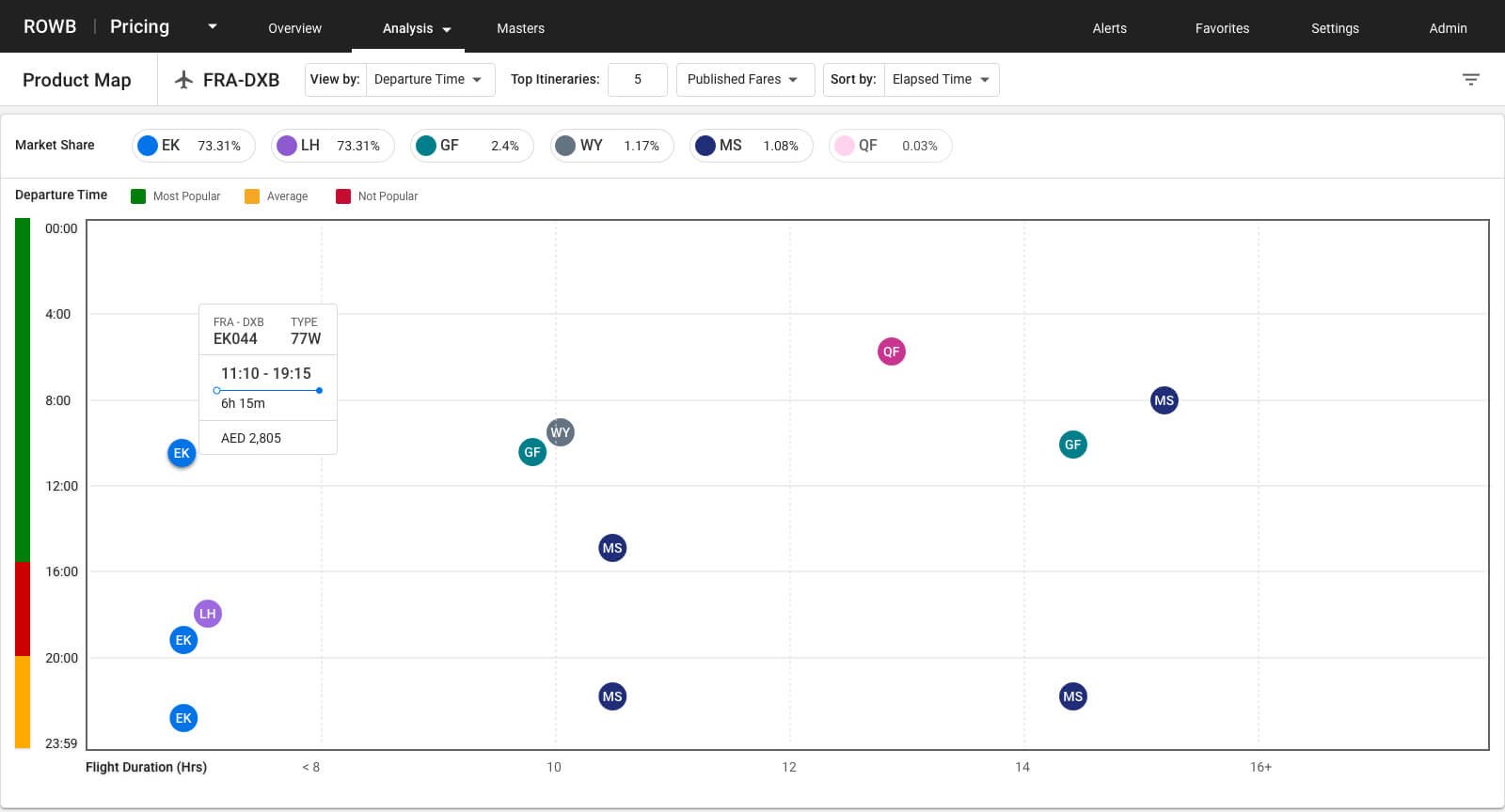
Revenue Optimization Workbench (ROWB) is an internal application used by the pricing analysts in Emirates airline to maximize the revenue, based on different factors like Miles, Class tier, Flight duration, Flight time and many more.
Context
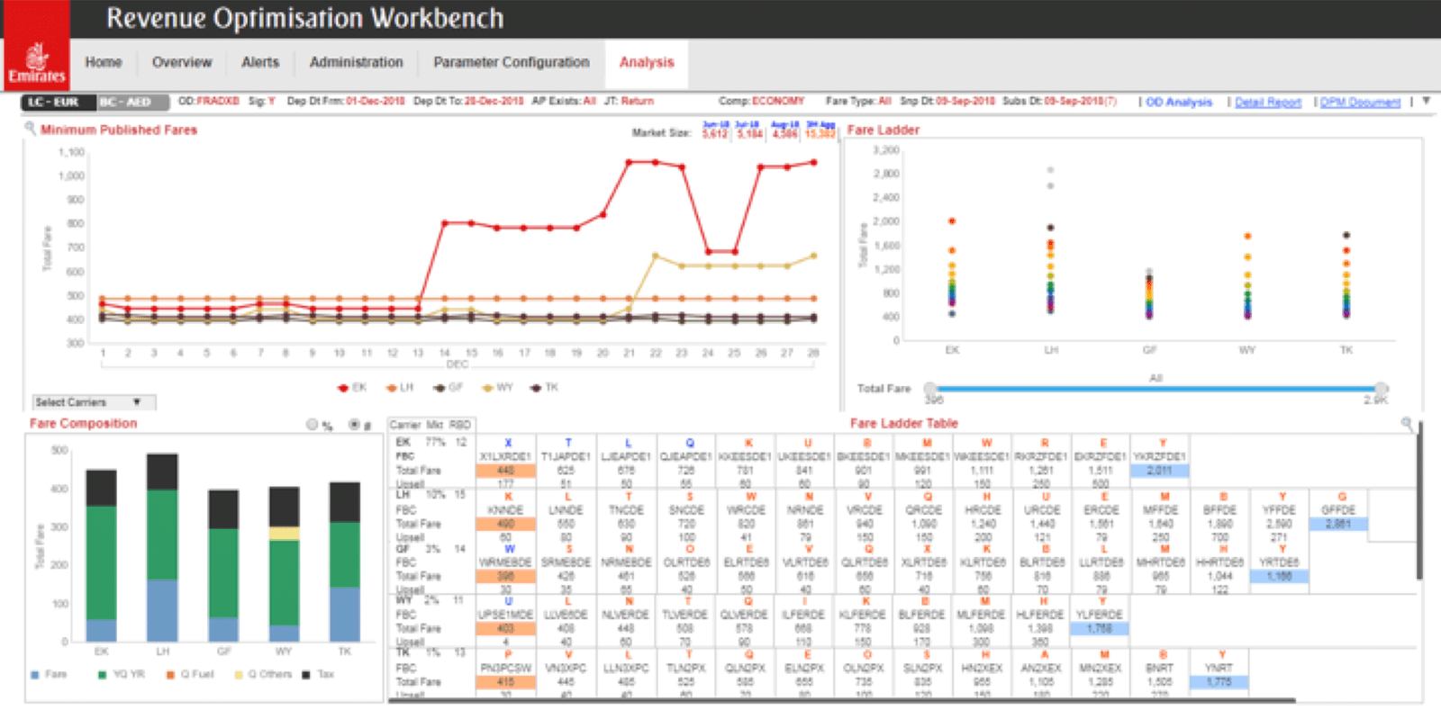
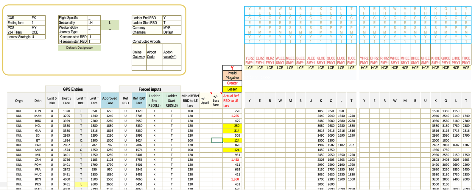
An old and complex tool used by experts.
Bringing the Emirates experience to the App
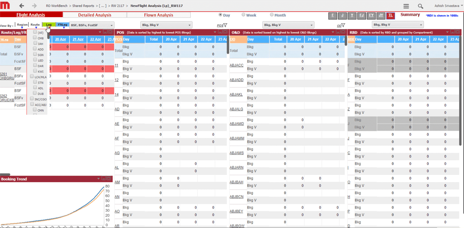
As with many things that are old and used by experts, the application had some faults that in regular use they could overlook, for example:
- Multiple disconnected systems and files
- Legacy code and design
- Not prepared for new joiners
Challenge
Upgrade the user experience taking into consideration:
Bringing the Emirates experience to the App
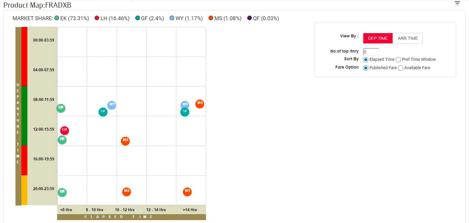
- Display the most relevant information
- Consider what already existed
- Design with speed and efficiency
- Prepare for the future
Process
What did the users say?
Sharing a common goal & understanding the size of it.
I shadowed and talked with the final users to understand how they were using the application and things that I should consider while redesigning the app.
“Make the most of the real state that we have”
“But I can use my excel file and upload it later”
“I don’t want to learn a new tool”
“I need something that works not beautifulness”
Ideation
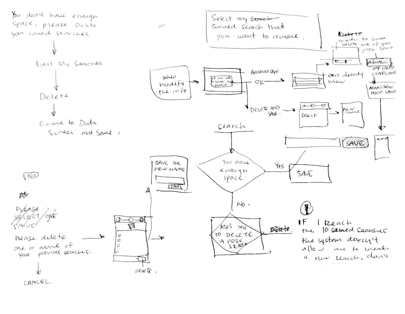
Mapping & ideating together
Sharing a common goal & understanding the size of it.
I mapped and sketched different journeys and solution with my Product Manager and Engineering team.
Working together helped us to align as a team and propose solutions that take into account everybody's feedback.
Refinement
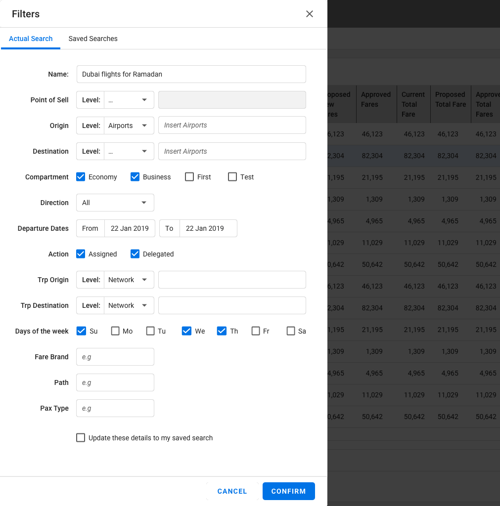
Refinement of sketches into High-fidelity designs
Designing with constraints allows me to have a compass of what I can and can't propose for the design.
Outcome
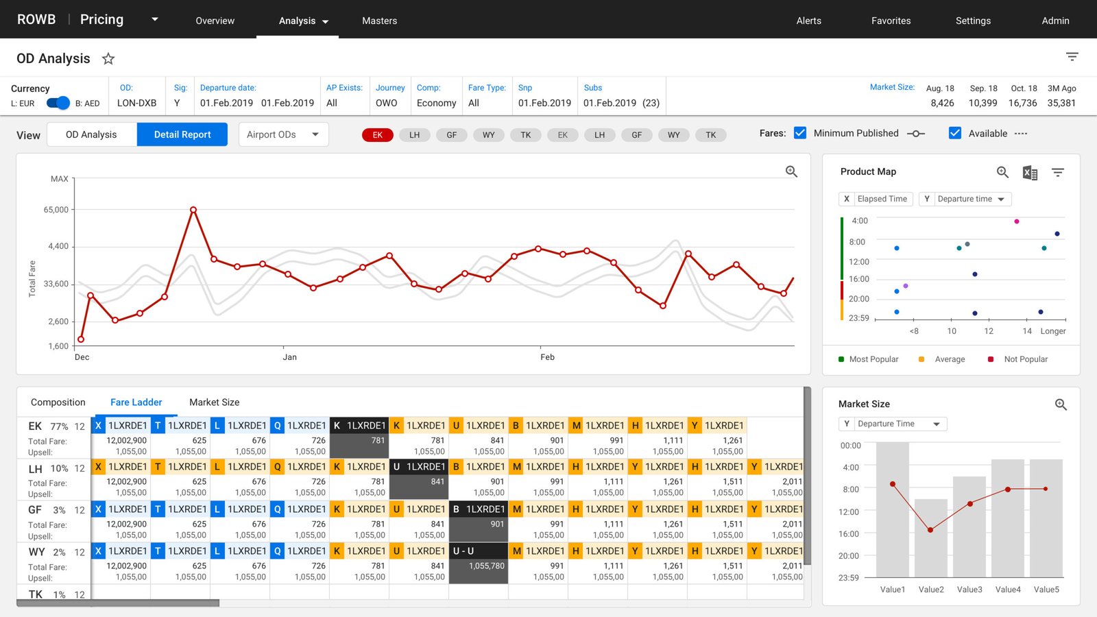
The final design
The final design
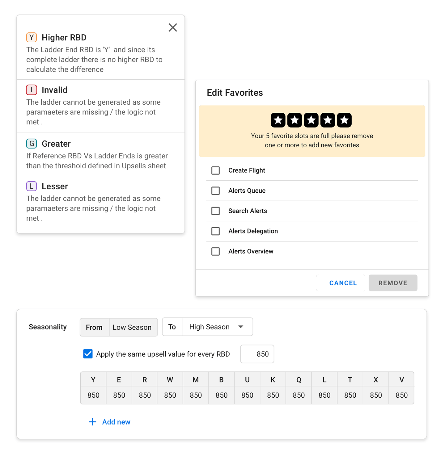
Special attention to the details.
The design improved the readability, scanability and accessibility, by using bigger fonts, reduced text styles and a colour palette library.
By working on the messaging and contextual information, we made an application easier to navigate and operate, reducing the cognitive load and improving the new analyst's onboarding.

Results
An award winning project
Reduced the time in data analysis
Quickly identified revenue optimization opportunities
Helped the team to take critical commercial decisions, by tracking the competition
Incremented Emirates revenue in 2019
Won the most important award in Emirates
Do you have any questions? Send me a message